
About
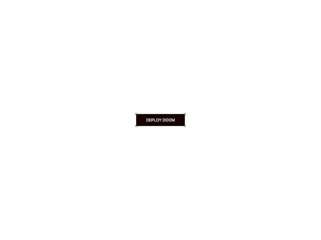
An animated button with sprung corner brackets, a diagonal patterned fill, and a power-up tap burst. On hover the brackets push outward and a fill panel arms; on tap it snaps to a teal charged state. Theme-aware via CSS vars, powered by Motion.
Built with React and Tailwind. Copy the prompt and paste it into Claude Code, Cursor or Lovable: your agent adds Click Power Up to your project and fits it to your theme.
Code
How Click Power Up is used: the demo's code. The component's own source comes with a free account.
Usage.tsx
"use client";

import { ClickPowerUp } from "@/components/ui/click-powerup";

export default function Default() {
  return (
    <div className="flex min-h-screen w-full items-center justify-center bg-background p-8">
      <ClickPowerUp>Deploy Doom</ClickPowerUp>
    </div>
  );
}
Dependencies
More by jay sharma
View all

Live Orb
391
Chrome Button
185
Frame Button
135
Shader Metal
99
Highlight Button
82
ASCII Fluid
77
Brutal Button
65
Motion Button
61
More in Buttons
View all
Texture Button
98

Button
1
Button
68

Eclipse Button
3

Button
65
Base Button
4

HeroUI Button Group
2

App Store Button
460

