
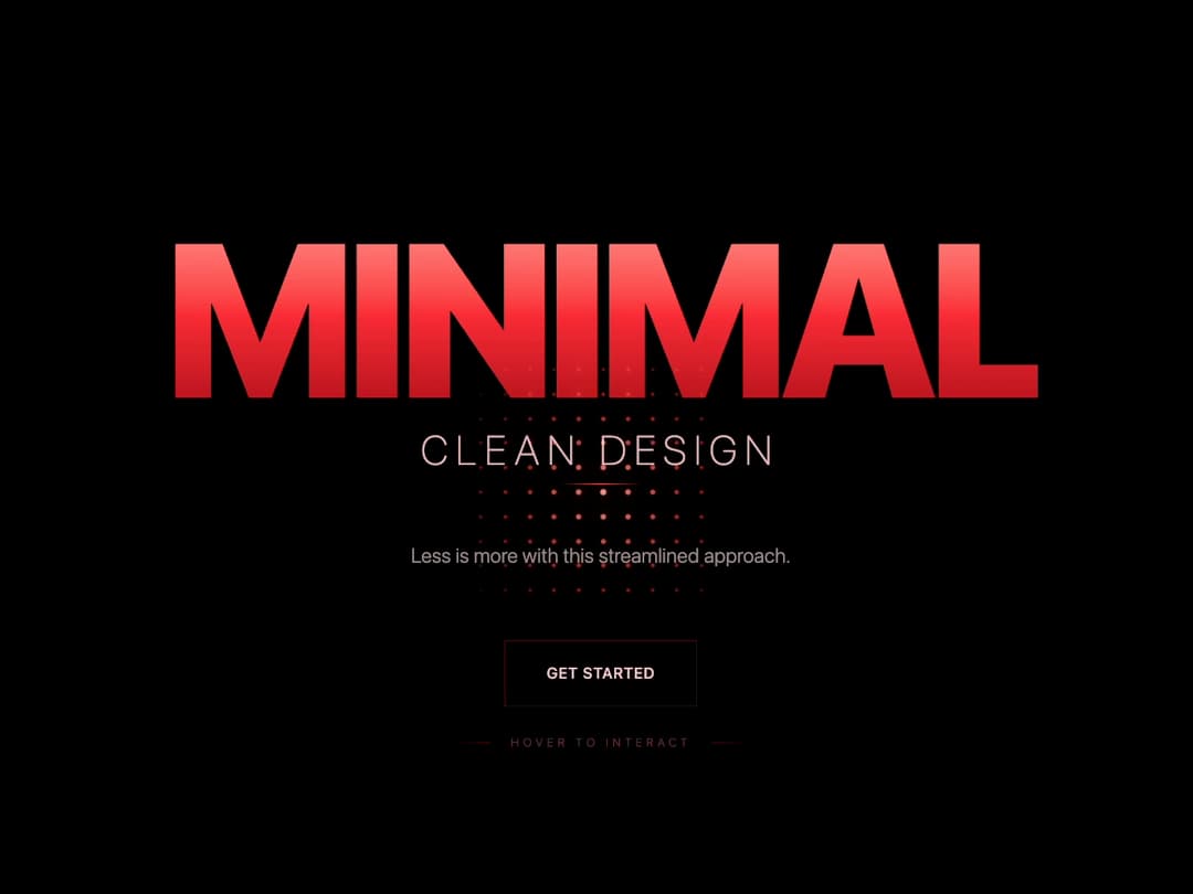
About
Bold hero section featuring a red gradient title and animated dot grid that dynamically follows cursor movement. Ideal for creative portfolios, landing pages, and modern minimal websites to engage users instantly.
Built with React and Tailwind. Copy the prompt and paste it into Claude Code, Cursor or Lovable: your agent adds Animated Hero to your project and fits it to your theme.
Code
How Animated Hero is used: the demo's code. The component's own source comes with a free account.
Usage.tsx
import {ParticleHero } from '@/components/ui/animated-hero'
// Demo Component
const ParticleHeroDemo = () => {
  return (
    <div className="min-h-screen w-full">
      <ParticleHero
        title="MINIMAL"
        subtitle="Clean Design"
        description="Less is more with this streamlined approach."
        particleCount={10}
        interactiveHint="Hover to Interact"
        primaryButton={{
          text: "Get Started",
          onClick: () => console.log("Started!")
        }}
      />
    </div>
  );
};

export default ParticleHeroDemo;More by Ravi Katiyar
View all

Animated Shader Hero
3.7K
Hero
3.2K
Circular Gallery
2.8K
Minimalist Hero
2.6K
Floating Icons Hero Section
1.9K
Glass Calendar
1.8K
Feature Carousel
1.7K
AI Image Generator Hero
1.4K
More in Heroes
View all

SaaS Template
2.5K

Responsive Hero Banner
2K

Hero
1.3K
Centered Hero with Image Fan
975

Aero Hero-3
579
Editorial Collage Hero
460
Glass Fold
305

HeroSectionWithGradient
351
