
About
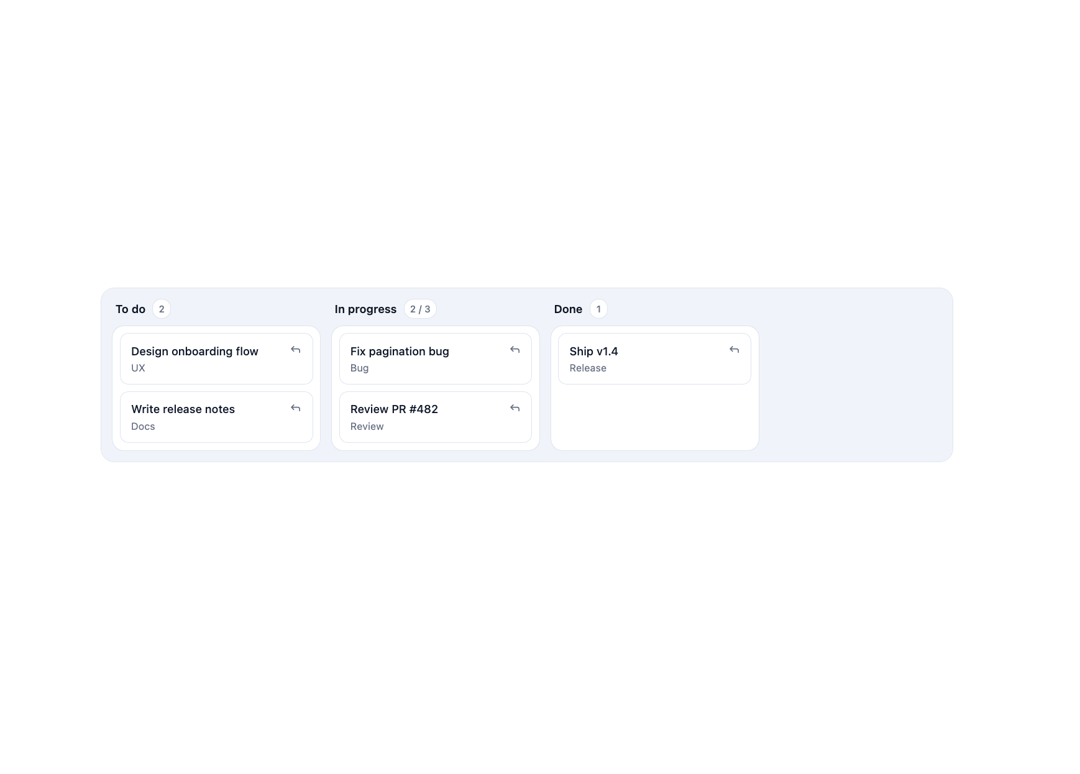
A drag, touch, and keyboard-accessible card-movement layer for a Kanban board, with a non-drag "Move" menu, drop validation, drop indicators, and optimistic moves with rollback on failure.
Built with React and Tailwind. Copy the prompt and paste it into Claude Code, Cursor or Lovable: your agent adds Kanban Card Movement to your project and fits it to your theme.
Code
How Kanban Card Movement is used: the demo's code. The component's own source comes with a free account.
Usage.tsx
"use client";

import * as React from "react";
import {
  KanbanCardMovement,
  type KanbanColumn,
  type KanbanCard,
} from "@/components/ui/kanban-card-movement";

const columns: KanbanColumn[] = [
  { id: "todo", title: "To do" },
  { id: "in-progress", title: "In progress", limit: 3 },
  { id: "done", title: "Done" },
];

const initialCards: KanbanCard[] = [
  {
    id: "1",
    columnId: "todo",
    title: "Design onboarding flow",
    order: 0,
    meta: "UX",
  },
  {
    id: "2",
    columnId: "todo",
    title: "Write release notes",
    order: 1,
    meta: "Docs",
  },
  {
    id: "3",
    columnId: "in-progress",
    title: "Fix pagination bug",
    order: 0,
    meta: "Bug",
  },
  {
    id: "4",
    columnId: "in-progress",
    title: "Review PR #482",
    order: 1,
    meta: "Review",
  },
  { id: "5", columnId: "done", title: "Ship v1.4", order: 0, meta: "Release" },
];

export default function KanbanCardMovementDemo() {
  const [cards, setCards] = React.useState<KanbanCard[]>(initialCards);

  return (
    <div className="w-full p-6">
      <KanbanCardMovement
        columns={columns}
        cards={cards}
        onMove={({ cardId, toColumn, toIndex }) => {
          setCards((prev) => {
            const moved = prev.find((c) => c.id === cardId);
            if (!moved) return prev;
            const rest = prev.filter((c) => c.id !== cardId);
            const inTarget = rest
              .filter((c) => c.columnId === toColumn)
              .sort((a, b) => a.order - b.order);
            inTarget.splice(toIndex, 0, { ...moved, columnId: toColumn });
            const others = rest.filter((c) => c.columnId !== toColumn);
            const reindexed = inTarget.map((c, i) => ({ ...c, order: i }));
            return [...others, ...reindexed];
          });
        }}
      />
    </div>
  );
}
Dependencies
More by Mehi
View all
Border Beam Panel
945
Compare Reveal
313
Decrypt Text
248
Holo Card
223
Magnetic Dock
167
Luminous Topography
110
Lens Card
86
Copperplate Hatch
59
More in Cards
View all

Course Design Cards
1.1K

Interactive Tech Stack Bento Grid with Hover Effects
223
Stats cards with links
84

Statistics Card 7
301

Card Studio
10
Statistics Card 2
276

Weather Card
59
Card
56
