
About
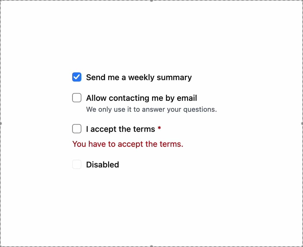
A checkbox form control with a label and optional description that works controlled or uncontrolled, and supports an indeterminate (partly checked) and a read-only state like a native checkbox.
Built with React and Tailwind. Copy the prompt and paste it into Claude Code, Cursor or Lovable: your agent adds Checkbox to your project and fits it to your theme.
Code
How Checkbox is used: the demo's code. The component's own source comes with a free account.
Usage.tsx
import Checkbox from "@/components/ui/checkbox";
import { useState } from "react";

export default function Basic() {
  const [accepted, setAccepted] = useState(false);

  return (
    <div className="space-y-4">
      <Checkbox
        defaultChecked
        label="Send me a weekly summary"
        name="summary"
      />
      <Checkbox
        description="We only use it to answer your questions."
        label="Allow contacting me by email"
        name="contact"
      />
      <Checkbox
        checked={accepted}
        error={accepted ? undefined : "You have to accept the terms."}
        label="I accept the terms"
        onChange={(event) => setAccepted(event.target.checked)}
        required
      />
      <Checkbox disabled label="Disabled" />
    </div>
  );
}
More by robertlib
View all
Timeline
9
Spinner
3
Collapsible Content
1
Chip
1
Switch
1
Progress Indicator
1
Avatar
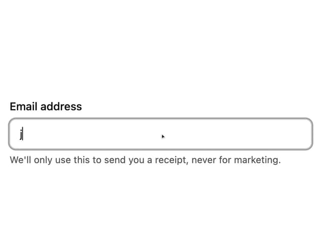
Form Description
More in Forms
View all

Contact Card
1K

Premium Auth
525

Login 2
8

Form
16

Card Studio
41

HeroUI Field Error
10

Book A Demo 1
74
Book A Demo 3
90