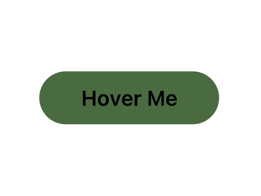
About
A hover-activated button with an animated wavy SVG stroke and a per-character wave text effect, useful for calls-to-action that need extra motion polish.
Built with React and Tailwind. Copy the prompt and paste it into Claude Code, Cursor or Lovable: your agent adds Wavy Button to your project and fits it to your theme.
Code
How Wavy Button is used: the demo's code. The component's own source comes with a free account.
Usage.tsx
import WavyButton from "@/components/ui/wavy-button";

export default function WavyButtonDemo() {
  return (
    <div className="flex items-center justify-center w-full h-screen">
      <WavyButton variant="default" size="lg">
        Hover Me
      </WavyButton>
    </div>
  );
}
Dependencies
More by scrollxui
View all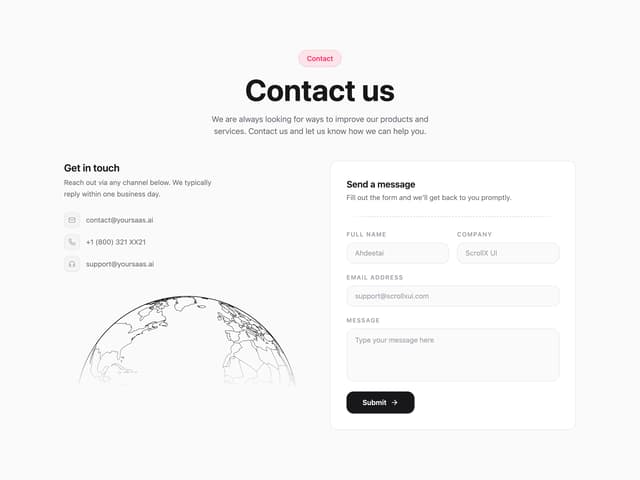

Contact with Globe
354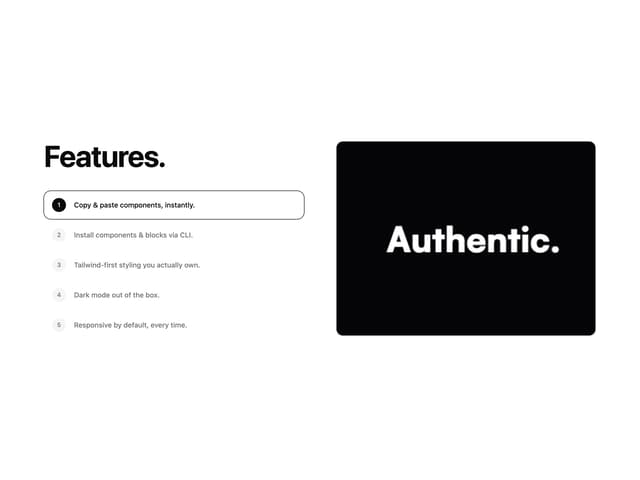
Features With Panel
320
Logo Cloud Marquee
155
Hero Section with Cards
150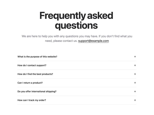
FAQ Accordion
150
Particles
99
Hero With Pixel Background
81
Testimonials Marquee
73
More in Buttons
View all
Texture Button
98

Button
1
Button
68

Button
65

Eclipse Button
3
Button Group
14
Base Button
4

App Store Button
459

