
About
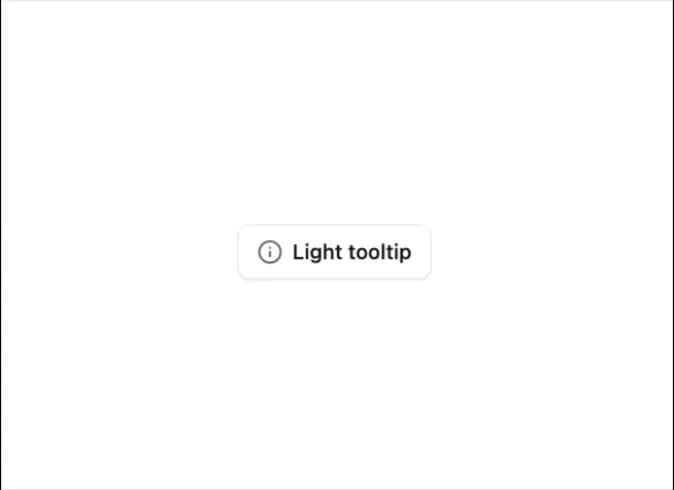
Displays brief, contextual information when hovering over or focusing on an element, improving clarity without cluttering the interface.
Built with React and Tailwind. Copy the prompt and paste it into Claude Code, Cursor or Lovable: your agent adds Tooltip to your project and fits it to your theme.
Code
How Tooltip is used: the demo's code. The component's own source comes with a free account.
Usage.tsx
import { Button } from '@/components/ui/button-1';
import { Tooltip, TooltipContent, TooltipProvider, TooltipTrigger } from '@/components/ui/tooltip';
import { Info } from 'lucide-react';

export default function TooltipDemo() {
  return (
    <TooltipProvider>
      <Tooltip>
        <TooltipTrigger asChild>
          <Button variant="outline">
            <Info className="h-4 w-4" />
            Light tooltip
          </Button>
        </TooltipTrigger>
        <TooltipContent variant="light">
          <p>Get detailed information about this feature.</p>
        </TooltipContent>
      </Tooltip>
    </TooltipProvider>
  );
}
Dependencies
More by Sean Hello
View all

3D Testimonails
3.4K
Line Charts 9
663
Alert
494
Line Charts 6
395
Area Charts 1
392
Scroll Area
377
Navigation Menu
321
Area Charts 2
318
More in Buttons
View all
Texture Button
98
Button
18

Eclipse Button
39

App Store Button
461

Button
9

Button Group
6
Button
4
Native Button
12


