
About
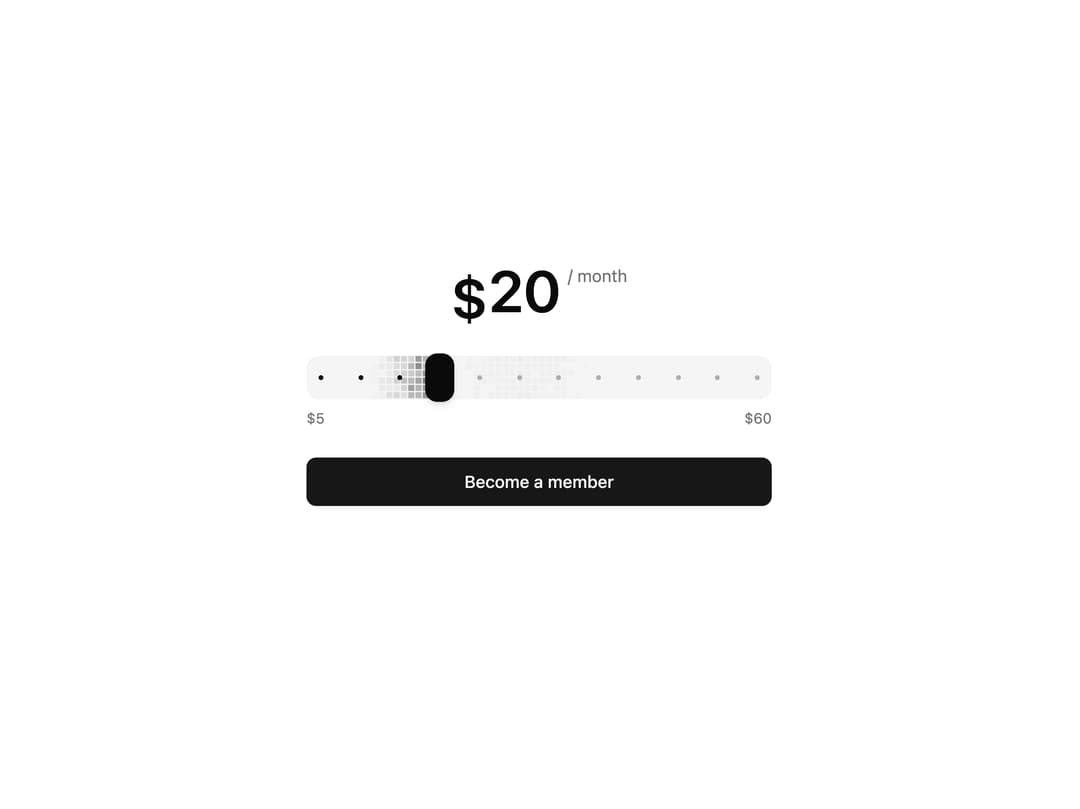
Amount slider drawn as a live grid of shimmering accent squares, with magnetic dot stops and a rolling-digit amount that counts up and down as you drag. Inspired by Claude Code slider.
Built with React and Tailwind. Copy the prompt and paste it into Claude Code, Cursor or Lovable: your agent adds Amount Slider to your project and fits it to your theme.
Code
How Amount Slider is used: the demo's code. The component's own source comes with a free account.
Usage.tsx
"use client"

import * as React from "react"

import { AmountReadout, AmountSlider } from "@/components/ui/amount-slider"

// Every $5 is a stop, so the thumb always lands on a round amount and the ticks
// show what there is to choose from.
const STOPS = [5, 10, 15, 20, 25, 30, 35, 40, 45, 50, 55, 60]

export default function AmountSliderDemo() {
  const [amount, setAmount] = React.useState(20)

  return (
    <div className="flex w-full items-center justify-center p-8">
      <div className="flex w-full max-w-sm flex-col gap-6">
        {/* The period rides near the top of the digits, not on their baseline,
            so the amount stays the one thing you read first. */}
        <div className="flex items-start justify-center gap-1.5">
          <AmountReadout value={amount} className="text-5xl leading-none" />
          <span className="mt-0.5 text-sm text-muted-foreground">/ month</span>
        </div>

        <div className="flex flex-col gap-2">
          <AmountSlider
            min={5}
            max={60}
            step={1}
            stops={STOPS}
            value={[amount]}
            onValueChange={([next]) => setAmount(next ?? 5)}
          />
          <div className="flex justify-between text-xs text-muted-foreground tabular-nums">
            <span>$5</span>
            <span>$60</span>
          </div>
        </div>

        <button
          type="button"
          className="h-10 w-full rounded-md bg-primary text-sm font-medium text-primary-foreground transition-[background-color,scale] duration-150 hover:bg-primary/90 active:scale-[0.99]"
        >
          Become a member
        </button>
      </div>
    </div>
  )
}
Dependencies
More by Serafim
View all
Spline Scene
9.6K
Testimonials with Marquee
2.3K
Gradient Button
2K
Pixel Canvas
913
Animated Blur Number
832
Empty State
782
Balloons
769
Status Badge
662
More in Pricing
View all
Pricing Section
610

Pricing Card
542

Pricing Section
183

RuixenPricing05
103
Single Pricing Card
799
Pricing Card With Features
176

Pricing Cards
17
Glowing Pricing Tiers
64


