
About
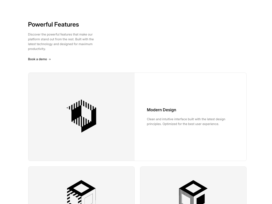
Feature cards in grid layout with Featured card at the top.
Built with React and Tailwind. Copy the prompt and paste it into Claude Code, Cursor or Lovable: your agent adds Feature 73 to your project and fits it to your theme.
Code
How Feature 73 is used: the demo's code. The component's own source comes with a free account.
Usage.tsx
import { Feature73 } from "@/components/ui/feature-73";

const DemoOne = () => {
  return (
    <Feature73 />
  );
};

export { DemoOne };
Dependencies
More by Shadcnblocks.com
View all

Gallery with image cards
3K
Hero 195
2.3K
Feature 108
1.3K
Navbar with Dropdowns
875
Footer 7
579
Gallery 6
566
Feature 197
527
About 3
435
More in Features
View all

Feature Sections
40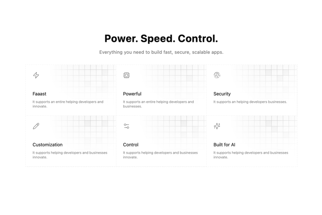

Grid Feature Cards
1.9K
Feature with advantages
284

Features 8
3.1K
Features Card
216

Features Grid
80
Features 2
325
Features 4
375

