
About
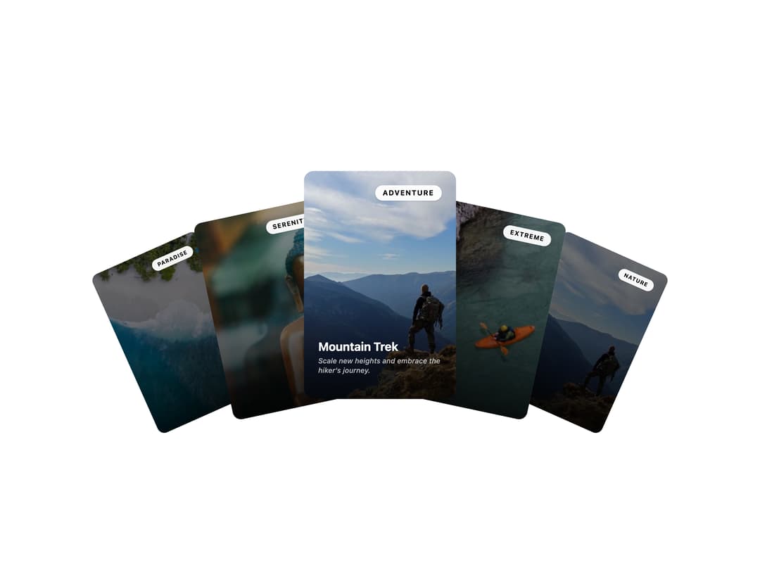
An interactive draggable carousel that fans out cards with rotation, overlap, and depth scaling for showcasing images or destinations.
Built with React and Tailwind. Copy the prompt and paste it into Claude Code, Cursor or Lovable: your agent adds Stacked Card Carousel to your project and fits it to your theme.
Code
How Stacked Card Carousel is used: the demo's code. The component's own source comes with a free account.
Usage.tsx
import CarouselStacked from "@/components/ui/carousel-07";

export default function Default() {
  return (
    <div className="w-full">
      <CarouselStacked />
    </div>
  );
}
Dependencies
More by ShadcnSpace
View all
Integration Card
1.8K
Button witn Icon
1.4K
Orbiting Circles with Globe
1.4K
Agency Hero Section
779
Testimonials Marquee
609
Shine Border
477
Social Icon
449
Range Select Calendar
424
More in Cards
View all

Course Design Cards
1.1K

Interactive Tech Stack Bento Grid with Hover Effects
227
Stats cards with links
84

Statistics Card 7
301

Card Studio
10
Statistics Card 2
276

Weather Card
59
Card
56
