
About
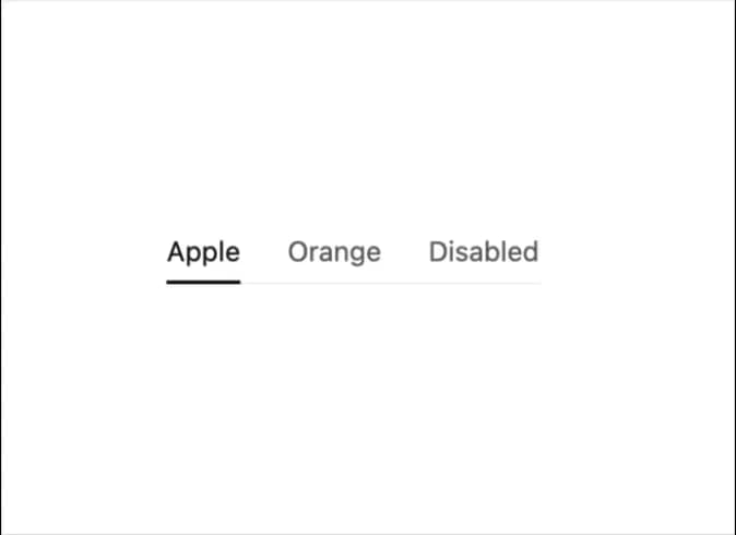
Display tab content.
Built with React and Tailwind. Copy the prompt and paste it into Claude Code, Cursor or Lovable: your agent adds Tabs to your project and fits it to your theme.
Code
How Tabs is used: the demo's code. The component's own source comes with a free account.
Usage.tsx
import { useState } from "react";
import { ITab, Tabs } from "@/components/ui/tabs-1";

const disabledTabs: ITab[] = [
  {
    title: "Apple",
    value: "apple"
  },
  {
    title: "Orange",
    value: "orange"
  },
  {
    title: "Disabled",
    value: "disabled",
    disabled: true,
    tooltip: "Disabled tooltip"
  }
];

export default function DisableSpecificTabsDemo() {
  const [selected, setSelected] = useState<string>("apple");
  return <Tabs selected={selected} setSelected={setSelected} tabs={disabledTabs} />;
}
Dependencies
More by tigran tumasov
View all
Product Hunt Badge
1.9K
Book
165
Calendar
155
Theme Switcher
137
Snippet
124
Table
123
Toggle
92
Feedback
90
More in Navigation
View all

Sidebar
296

Progress Bar Stepper
43
Tabs
16
Navbar
1
Breadcrumb
103

Capsule Tabs
21

Pagination
91
Pagination
27
