
About
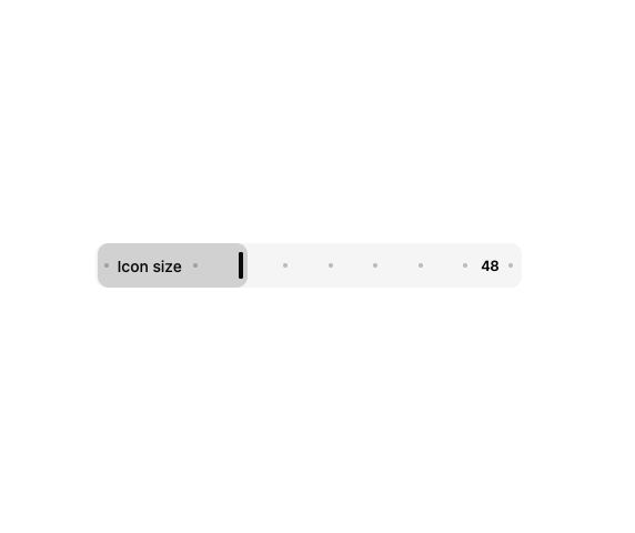
A compact draggable slider that shows its label and current value directly inside the track, with the thumb parting around the text as it slides past.
Built with React and Tailwind. Copy the prompt and paste it into Claude Code, Cursor or Lovable: your agent adds Inline Slider to your project and fits it to your theme.
Code
How Inline Slider is used: the demo's code. The component's own source comes with a free account.
Usage.tsx
import { InlineSlider } from "@/components/ui/range-slider-inline";

export function InlineSliderPreview() {
  return (
    <div className="w-full max-w-sm">
      <InlineSlider
        defaultValue={48}
        min={8}
        max={128}
        step={8}
        label="Icon size"
        aria-label="Icon size"
        formatValueText={(value) => `${value} pixels`}
      />
    </div>
  );
}

export default InlineSliderPreview;
Dependencies
More by sidiora-labs
View all
Wave Slider
6
Icon Accordion
6
Preview Rail
5
Expandable Tabs
3
Color List
3
Not Found
2
Motion Breadcrumb
2
Wallet Card
2
More in Forms
View all

Premium Auth
525

Contact Card
1K

Book A Demo 1
74

Form
16

Login 1
53
Book A Demo 3
89
Login Card
6
Hand-Drawn Checkbox
48

