
About
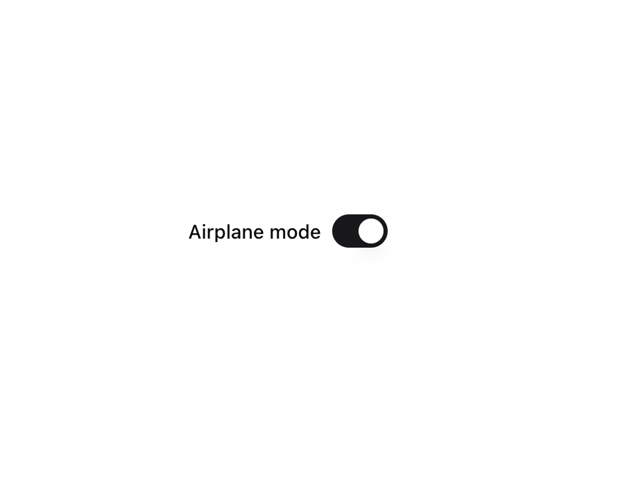
A control that allows the user to toggle between checked and not checked.
Built with React and Tailwind. Copy the prompt and paste it into Claude Code, Cursor or Lovable: your agent adds Radix Switch to your project and fits it to your theme.
Code
How Radix Switch is used: the demo's code. The component's own source comes with a free account.
Usage.tsx
import { Switch } from "@/components/ui/radix-switch";

export const RadixSwitchDemo = () => (
    <div className="flex items-center space-x-2">
        <label htmlFor="airplane-mode" className="text-sm leading-none font-medium select-none">Airplane mode</label>
        <Switch defaultChecked id="airplane-mode" />
    </div>
);
Dependencies
More by Elliot Sutton
View all

Notification List
216
Scroll Progress
140
Cursor
127
Pin List
111
Radix Dropdown Menu
101
Flip Button
98
Bubble Background
92
Avatar Group
87
More in Forms
View all

Contact Card
1K

Premium Auth
525

Form
16

Card Studio
41

Login 2
7

Book A Demo 3
90
Book A Demo 1
74

HeroUI Field Error
10