
About
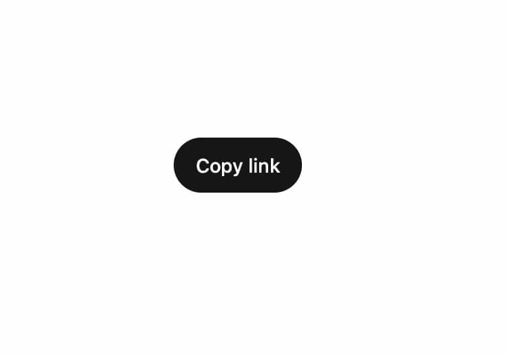
Animated button whose label swaps letter-by-letter — the old text's characters roll away as the new ones drop in, left to right — ideal for copy/copied and other stateful action toggles.
Built with React and Tailwind. Copy the prompt and paste it into Claude Code, Cursor or Lovable: your agent adds Action Swap Cascade to your project and fits it to your theme.
Code
How Action Swap Cascade is used: the demo's code. The component's own source comes with a free account.
Usage.tsx
"use client";

import { ActionSwapCascadeButton } from "@/components/ui/action-swap-cascade";

const CTA_ITEMS = [
  { id: "copy", label: "Copy link", ariaLabel: "Copy link" },
  { id: "copied", label: "Copied!", ariaLabel: "Copied" },
];

export default function ActionSwapCascadePreview() {
  return (
    <div className="flex w-full justify-center">
      <ActionSwapCascadeButton items={CTA_ITEMS} variant="primary" />
    </div>
  );
}
More by Saurabh
View all
BeUI Tilt Card
376
BeUI Expandable Tabs
353
BeUI File Upload
296
Animated Sidebar
214
BeUI Bouncy Accordion
208
BeUI Create Menu
200
BeUI Expanable Action Bar
196
Loader
190
More in Buttons
View all
Texture Button
98

Button
1
Button
68

Button
65

Eclipse Button
3
Base Button
4

HeroUI Button Group
2

App Store Button
460

