
About
Built with React and Tailwind. Copy the prompt and paste it into Claude Code, Cursor or Lovable: your agent adds Beui Checkbox to your project and fits it to your theme.
Code
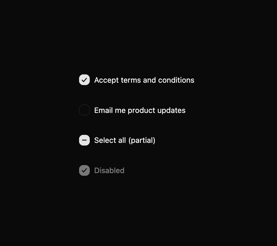
How Beui Checkbox is used: the demo's code. The component's own source comes with a free account.
Usage.tsx
"use client";

import { useState } from "react";
import { Checkbox } from "@/components/ui/beui-checkbox";

export default function CheckboxPreview() {
  const [terms, setTerms] = useState(true);
  const [updates, setUpdates] = useState(false);

  return (
    <div className="flex flex-col gap-3">
      <Checkbox
        checked={terms}
        onCheckedChange={setTerms}
        label="Accept terms and conditions"
      />
      <Checkbox
        checked={updates}
        onCheckedChange={setUpdates}
        label="Email me product updates"
      />
      <Checkbox checked indeterminate onCheckedChange={() => {}} label="Select all (partial)" />
      <Checkbox checked disabled onCheckedChange={() => {}} label="Disabled" />
    </div>
  );
}
Dependencies
More by Saurabh
View all
BeUI Tilt Card
374
BeUI Expandable Tabs
352
BeUI File Upload
297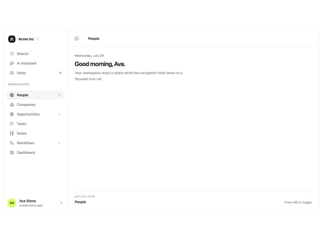
Animated Sidebar
211
BeUI Bouncy Accordion
207
BeUI Create Menu
200
BeUI Expanable Action Bar
196
Loader
190
More in Forms
View all

Contact Card
1K

Premium Auth
525

Form
16

Card Studio
41

Login 2
7

Book A Demo 3
90
Book A Demo 1
74

HeroUI Field Error
10