
About
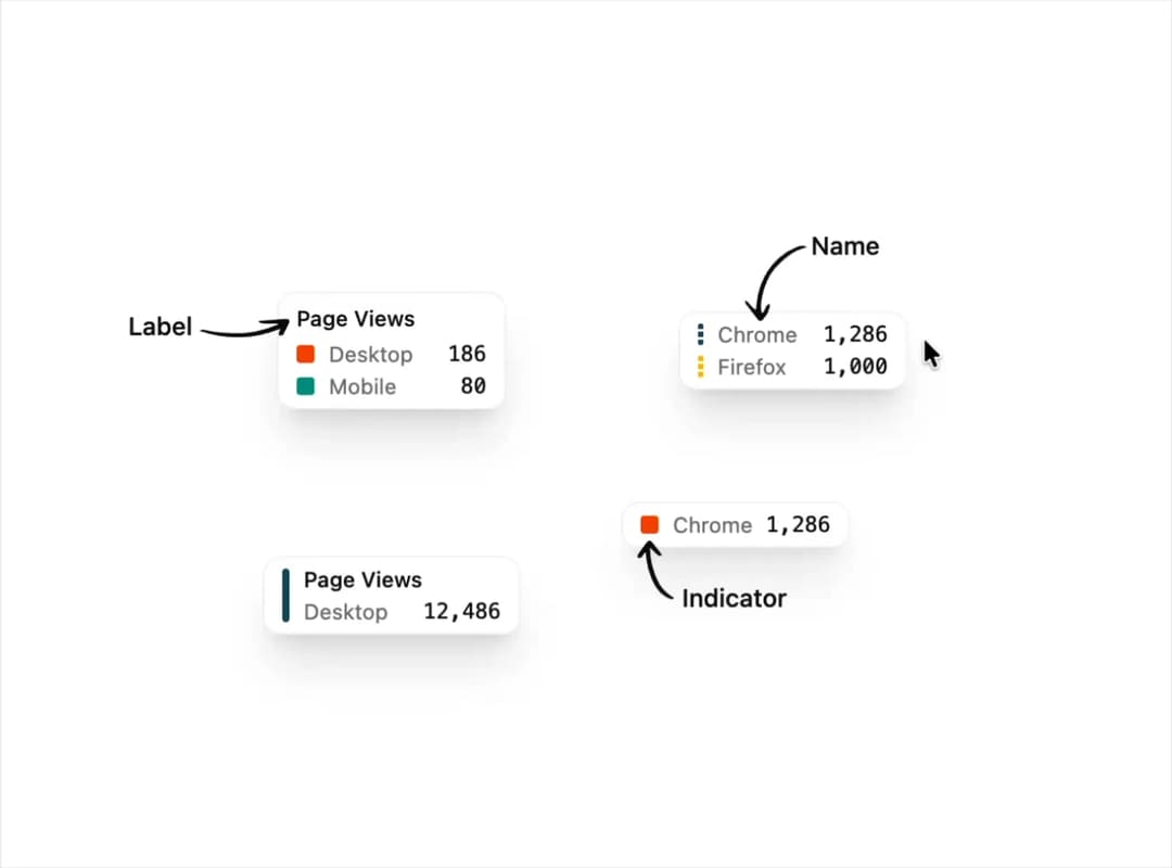
A styled tooltip content block for data charts that shows labeled values with colored dot, line, or dashed indicators next to each series.
Built with React and Tailwind. Copy the prompt and paste it into Claude Code, Cursor or Lovable: your agent adds Chart Tooltip to your project and fits it to your theme.
Code
How Chart Tooltip is used: the demo's code. The component's own source comes with a free account.
Usage.tsx
import ChartTooltip from "@/components/ui/chart-tooltip";

export default function ChartTooltipDemoUsage() {
  return <ChartTooltip />;
}
More by uiable
View all

Feature Highlights Grid
400
Card Tabs
110
Financial Bento Grid
88
Portfolio Showcase Grid
68
Marketing Hero Section
66
Sidebar with Search and Profile
56
Position Sonner
48
Attachment States
44
More in Dashboards
View all
Dashboard with Collapsible Sidebar
2.5K

Sidebar
294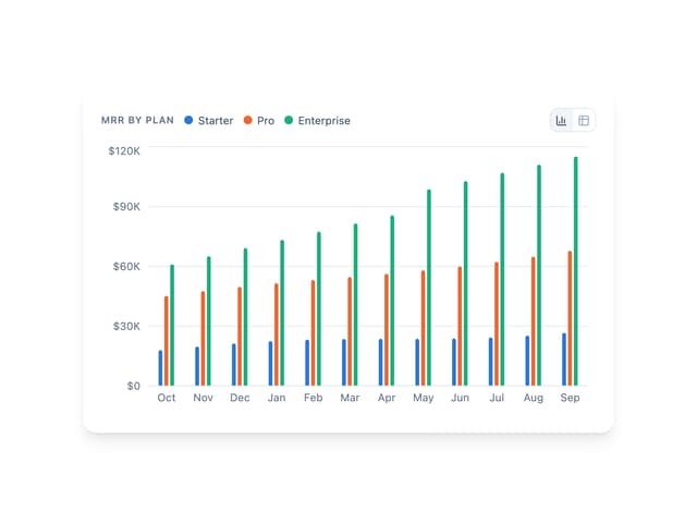
Bar Chart
3

SaaS Template
2.5K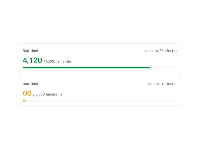
Rate Limit Meter
26

System Status Block
316

Course Design Cards
1.1K

Chat template
620


