
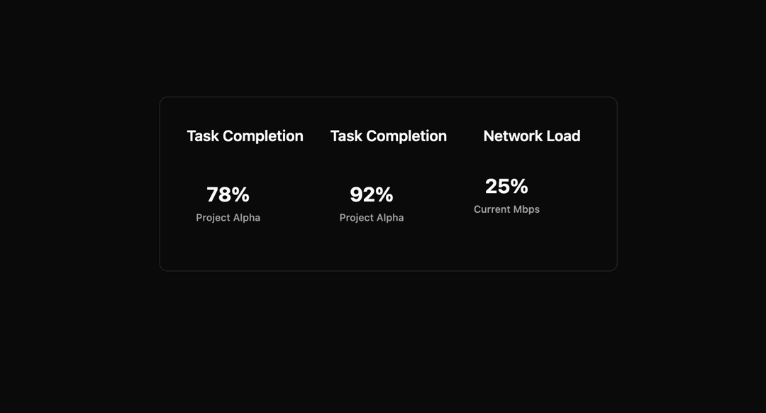
The Progress Ring component is a modern, animated circular progress indicator designed for professional dashboards, SaaS products, and data visualization interfaces. Built with React, TypeScript, TailwindCSS, shadcn/ui, and Framer Motion, it combines accessibility, smooth motion, and theme adaptability into a single, production-ready UI element. It features a background track and a foreground animated stroke that dynamically reflects percentage-based progress values (0–100). Using Framer Motion’s animation engine, the progress ring animates smoothly, giving users a visually intuitive representation of completion, utilization, or performance metrics. The component is highly configurable—you can adjust size, stroke width, text styles, and labels—making it suitable for use across small inline widgets, large dashboard cards, or compact mobile layouts. The percentage value is displayed inside the ring with a bold numeric readout, and an optional label can be placed underneath for context (e.g., “Used Capacity,” “Project Completion,” or “Current Load”). The design integrates seamlessly with light and dark themes, relying on shadcn’s CSS variables (--primary, --muted, --foreground) to ensure brand consistency and accessibility. It also includes ARIA attributes (role="progressbar", aria-valuenow, aria-label) for screen readers, making it fully inclusive. Typical use cases include: Storage Utilization (e.g., “75% of capacity used”) Task or Project Completion (e.g., “92% completed”) Performance Metrics (e.g., network load, CPU usage, sales goals) Gamification / Achievements (e.g., progress toward a reward) This component balances enterprise-level polish with developer-friendly flexibility, ensuring it can be reused and adapted in complex web applications where clarity and performance matter most.
Built with React and Tailwind. Copy the prompt and paste it into Claude Code, Cursor or Lovable: your agent adds Progress bar to your project and fits it to your theme.
Code
How Progress bar is used: the demo's code. The component's own source comes with a free account.
Usage.tsx
import ExampleUsage from "@/components/ui/progress-bar";

export default function DemoOne() {
  return <ExampleUsage />;
}
Dependencies
More by Sonu kumar
View all
Dashboard with Collapsible Sidebar
2.5K
Modern Hero
1.4K
Text Parallax Content (scroll)
1.2K
About Us section
1.2K
Modern Animated Hero Section
1.2K
Animated Hero Section
694
Cuisine Selector Chips
595
Bounce card features
582
More in Dashboards
View all

Sidebar
305

SaaS Template
2.5K

System Status Block
319

Course Design Cards
1.1K
Stats Bento
1.1K

Chat template
626

Data Grid Table
7

Web3Bento
620
