
About
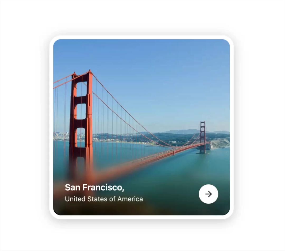
Progressive Blur Card A clean and modern card component with a smooth progressive blur effect that makes images pop while keeping text perfectly readable. Great for travel apps, portfolios, and landing pages. This card comes with a subtle gradient overlay, bold typography, and a simple call-to-action button that feels natural on any UI.
Built with React and Tailwind. Copy the prompt and paste it into Claude Code, Cursor or Lovable: your agent adds Progressive Blur Card to your project and fits it to your theme.
Code
How Progressive Blur Card is used: the demo's code. The component's own source comes with a free account.
Usage.tsx
import { ProgressiveBlurCard } from '@/components/ui/progressive-blur-card';

export default function Demo() {
  return (
    <div className="min-h-screen w-full bg-white flex items-center justify-center p-8">
      <ProgressiveBlurCard />
    </div>
  );
}
Dependencies
More by waiz
View all

SaaS Template
2.5K
image auto slider
1.8K
Silk-Background-animation
941
Portfolio Hero
912
Gradient bars Background
599
Glow Button
399
Spotlight Button
386
Gradient Bar hero section
346
More in Cards
View all

Course Design Cards
1.1K

Interactive Tech Stack Bento Grid with Hover Effects
223
Stats cards with links
84

Statistics Card 7
301

Card Studio
10
Statistics Card 2
276

Weather Card
59
Card
56
