
About
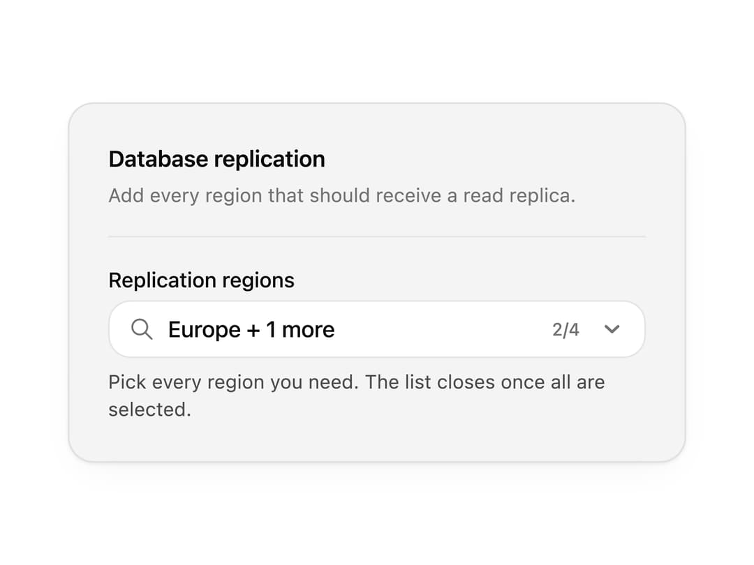
A searchable combobox with autocomplete, grouped results, multiple selection and empty states. Use it for country pickers, assignee selectors and any long option list.
Built with React and Tailwind. Copy the prompt and paste it into Claude Code, Cursor or Lovable: your agent adds Combobox to your project and fits it to your theme.
Code
How Combobox is used: the demo's code. The component's own source comes with a free account.
Usage.tsx
"use client";

import * as React from "react";
import { IconCloud, IconGlobe, IconMapPin } from "@tabler/icons-react";
import { Combobox, type ComboboxOption } from "@/components/ui/combobox";

import { clsx, type ClassValue } from "clsx";
import { twMerge } from "tailwind-merge";

function cn(...inputs: ClassValue[]) {
  return twMerge(clsx(inputs));
}

const primitivePreviewCardSurfaceFrameClass = cn(
  "relative isolate overflow-hidden rounded-2xl",
  "border",
);

const primitivePreviewCardSurfaceLightClass = cn(
  "border-black/[0.08] bg-[#f4f4f5]",
  "[box-shadow:0_1px_2px_rgba(0,0,0,.06),0_8px_24px_-12px_rgba(0,0,0,.08)]",
);

const primitivePreviewCardSurfaceClass = cn(
  primitivePreviewCardSurfaceFrameClass,
  primitivePreviewCardSurfaceLightClass,
  // Full static `dark:bg-[#0a0a0b]` kept for Tailwind content scan - same as
  // PRIMITIVE_PREVIEW_CANVAS_DARK_BG / PRIMITIVE_PREVIEW_CANVAS_DARK.
  "dark:border-white/[0.06] dark:bg-[#0a0a0b] dark:[box-shadow:0_1px_2px_rgba(0,0,0,.4),0_8px_24px_-12px_rgba(0,0,0,.6)]",
);

const wensityCardSurfaceClass = primitivePreviewCardSurfaceClass;

function PreviewPanel({
  children,
  className,
  title,
  subtitle,
}: {
  children: React.ReactNode;
  className?: string;
  title?: string;
  subtitle?: string;
}) {
  return (
    <div
      className={cn(
        wensityCardSurfaceClass,
        "w-full max-w-md p-5 sm:p-6",
        className,
      )}
    >
      {title ? (
        <div className="mb-5 border-b border-[var(--border)] pb-4">
          <p className="text-sm font-semibold tracking-[-0.015em] text-[var(--foreground)]">
            {title}
          </p>
          {subtitle ? (
            <p className="mt-1 text-[12px] leading-[1.5] text-[var(--muted-foreground)]">
              {subtitle}
            </p>
          ) : null}
        </div>
      ) : null}
      {children}
    </div>
  );
}

const replicationRegionOptions: ComboboxOption[] = [
  {
    value: "iad",
    label: "US East",
    description: "Virginia, primary for North America.",
    leading: <IconMapPin stroke={1.75} />,
  },
  {
    value: "fra",
    label: "Europe",
    description: "Frankfurt - EU data residency.",
    leading: <IconGlobe stroke={1.75} />,
  },
  {
    value: "sin",
    label: "Asia Pacific",
    description: "Singapore - APAC failover.",
    leading: <IconCloud stroke={1.75} />,
  },
  {
    value: "syd",
    label: "Australia",
    description: "Sydney - Oceania coverage.",
    leading: <IconGlobe stroke={1.75} />,
  },
];

function ReplicationRegionsField({
  comboboxSize,
  showLabel = true,
}: {
  comboboxSize?: "sm" | "md" | "lg";
  showLabel?: boolean;
}) {
  const [regions, setRegions] = React.useState<string[]>(["fra", "sin"]);
  const allSelected = regions.length >= replicationRegionOptions.length;

  return (
    <Combobox
      multiple
      comboboxSize={comboboxSize}
      label={showLabel ? "Replication regions" : undefined}
      placeholder="Search regions to add…"
      value={regions}
      onValueChange={(next) => setRegions(Array.isArray(next) ? next : [])}
      options={replicationRegionOptions}
      emptySelectionLabel="No replication regions selected."
      status={allSelected ? "success" : "default"}
      success={
        allSelected ? "All replication regions are active for this database." : undefined
      }
      hint={
        showLabel && !allSelected
          ? "Pick every region you need. The list closes once all are selected."
          : undefined
      }
    />
  );
}

export function ComboboxPreview() {
  return (
    <PreviewPanel
      className="max-w-sm"
      title="Database replication"
      subtitle="Add every region that should receive a read replica."
    >
      <ReplicationRegionsField />
    </PreviewPanel>
  );
}

export default function Demo() {
  return <ComboboxPreview />;
}
Dependencies
More by Wensity Labs
View all

Sidebar
295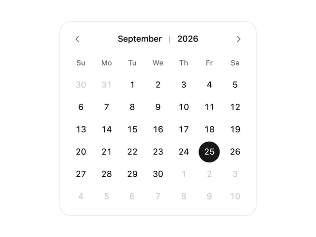
Calendar
197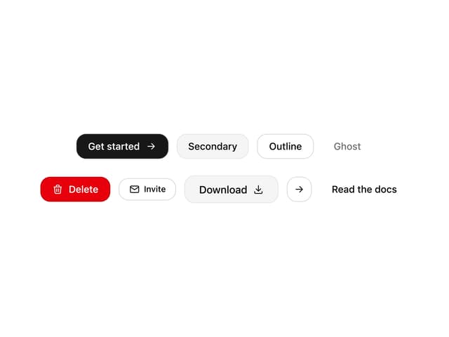
Button
93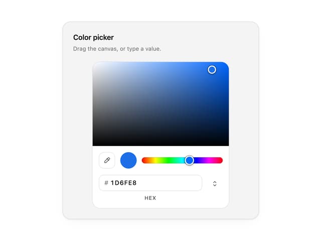
Color Picker
71
Image Comparison Slider
68
AI Prompt Input
55
Text Morphing
43
Carousel
39
More in Forms
View all

Contact Card
1K

Premium Auth
525

Form
16

Card Studio
41

Login 2
7

Book A Demo 3
90
Book A Demo 1
74

HeroUI Field Error
10