
About
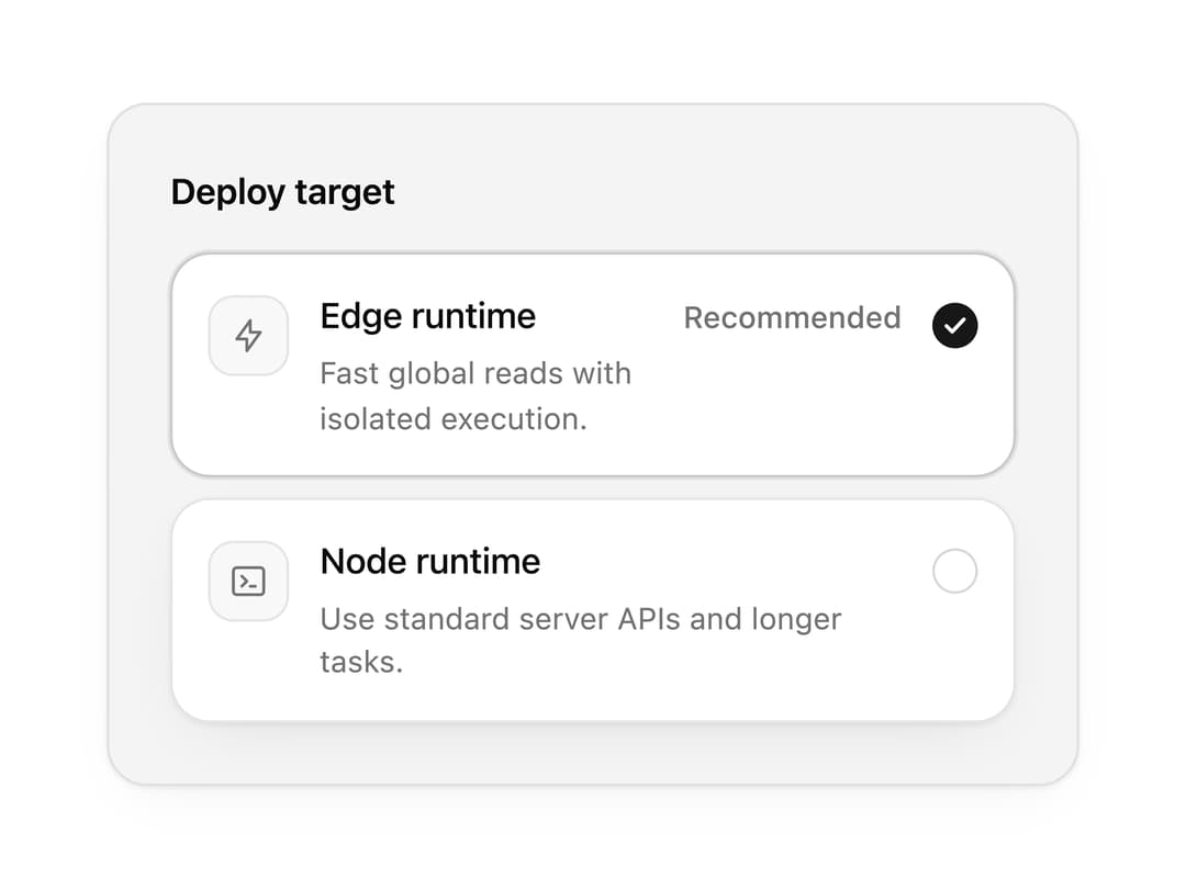
A radio group with classic rows, a segmented control layout and selectable cards, plus an animated selection indicator. Great for plan pickers, shipping options and settings.
Built with React and Tailwind. Copy the prompt and paste it into Claude Code, Cursor or Lovable: your agent adds Radio Group to your project and fits it to your theme.
Code
How Radio Group is used: the demo's code. The component's own source comes with a free account.
Usage.tsx
"use client";

import { IconBolt, IconTerminal2 } from "@tabler/icons-react";
import { RadioGroup, RadioOption } from "@/components/ui/radio-group";

import { clsx, type ClassValue } from "clsx";
import { twMerge } from "tailwind-merge";

function cn(...inputs: ClassValue[]) {
  return twMerge(clsx(inputs));
}

const primitivePreviewCardSurfaceFrameClass = cn(
  "relative isolate overflow-hidden rounded-2xl",
  "border",
);

const primitivePreviewCardSurfaceLightClass = cn(
  "border-black/[0.08] bg-[#f4f4f5]",
  "[box-shadow:0_1px_2px_rgba(0,0,0,.06),0_8px_24px_-12px_rgba(0,0,0,.08)]",
);

const primitivePreviewCardSurfaceClass = cn(
  primitivePreviewCardSurfaceFrameClass,
  primitivePreviewCardSurfaceLightClass,
  // Full static `dark:bg-[#0a0a0b]` kept for Tailwind content scan - same as
  // PRIMITIVE_PREVIEW_CANVAS_DARK_BG / PRIMITIVE_PREVIEW_CANVAS_DARK.
  "dark:border-white/[0.06] dark:bg-[#0a0a0b] dark:[box-shadow:0_1px_2px_rgba(0,0,0,.4),0_8px_24px_-12px_rgba(0,0,0,.6)]",
);

const wensityCardSurfaceClass = primitivePreviewCardSurfaceClass;

function PreviewPanel({
  children,
  className,
  title,
  subtitle,
}: {
  children: React.ReactNode;
  className?: string;
  title?: string;
  subtitle?: string;
}) {
  return (
    <div
      className={cn(
        wensityCardSurfaceClass,
        "w-full max-w-md",
        "p-5 sm:p-6",
        className,
      )}
    >
      {title ? (
        <div className="mb-5 border-b border-[var(--border)] pb-4">
          <p className="text-sm font-semibold tracking-[-0.015em] text-[var(--foreground)]">
            {title}
          </p>
          {subtitle ? (
            <p className="mt-1 text-[12px] leading-[1.5] text-[var(--muted-foreground)]">
              {subtitle}
            </p>
          ) : null}
        </div>
      ) : null}
      {children}
    </div>
  );
}

export function RadioGroupPreview() {
  return (
    <PreviewPanel className="max-w-sm">
      <RadioGroup
        label="Deploy target"
        defaultValue="edge"
        variant="command"
      >
        <RadioOption
          value="edge"
          label="Edge runtime"
          description="Fast global reads with isolated execution."
          leading={<IconBolt stroke={1.75} />}
          trailing="Recommended"
        />
        <RadioOption
          value="node"
          label="Node runtime"
          description="Use standard server APIs and longer tasks."
          leading={<IconTerminal2 stroke={1.75} />}
        />
      </RadioGroup>
    </PreviewPanel>
  );
}

export default function Demo() {
  return <RadioGroupPreview />;
}
Dependencies
More by Wensity Labs
View all

Sidebar
295
Calendar
197
Button
93
Color Picker
71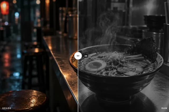
Image Comparison Slider
68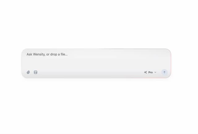
AI Prompt Input
55
Text Morphing
43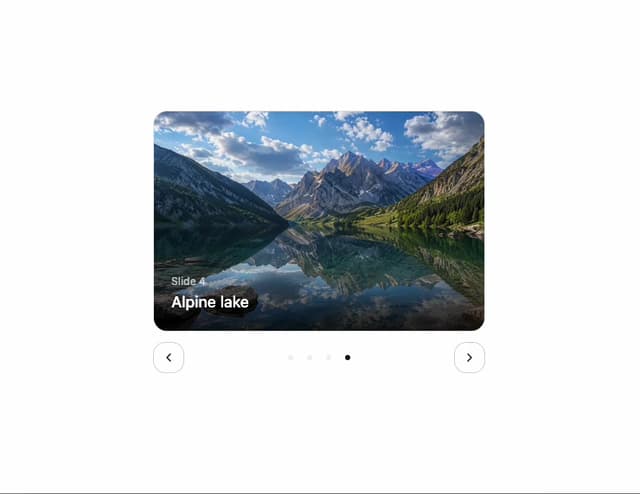
Carousel
39
More in Cards
View all

Course Design Cards
1.1K

Interactive Tech Stack Bento Grid with Hover Effects
222
Stats cards with links
84

Statistics Card 7
301

Card Studio
10
Statistics Card 2
276

Weather Card
59
Card
56
