
About
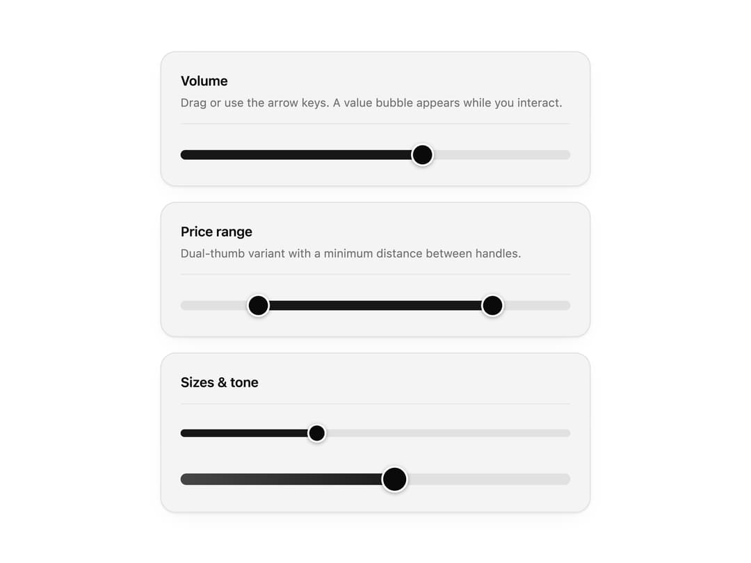
An accessible range slider with single and dual thumbs, steps and a value bubble that appears on drag or focus. Use it for prices, volume and filter ranges.
Built with React and Tailwind. Copy the prompt and paste it into Claude Code, Cursor or Lovable: your agent adds Slider to your project and fits it to your theme.
Code
How Slider is used: the demo's code. The component's own source comes with a free account.
Usage.tsx
"use client";

import * as React from "react";
import { Slider, SliderRange } from "@/components/ui/slider";

import { clsx, type ClassValue } from "clsx";
import { twMerge } from "tailwind-merge";

function cn(...inputs: ClassValue[]) {
  return twMerge(clsx(inputs));
}

const primitivePreviewCardSurfaceFrameClass = cn(
  "relative isolate overflow-hidden rounded-2xl",
  "border",
);

const primitivePreviewCardSurfaceLightClass = cn(
  "border-black/[0.08] bg-[#f4f4f5]",
  "[box-shadow:0_1px_2px_rgba(0,0,0,.06),0_8px_24px_-12px_rgba(0,0,0,.08)]",
);

const primitivePreviewCardSurfaceClass = cn(
  primitivePreviewCardSurfaceFrameClass,
  primitivePreviewCardSurfaceLightClass,
  // Full static `dark:bg-[#0a0a0b]` kept for Tailwind content scan - same as
  // PRIMITIVE_PREVIEW_CANVAS_DARK_BG / PRIMITIVE_PREVIEW_CANVAS_DARK.
  "dark:border-white/[0.06] dark:bg-[#0a0a0b] dark:[box-shadow:0_1px_2px_rgba(0,0,0,.4),0_8px_24px_-12px_rgba(0,0,0,.6)]",
);

function PreviewPanel({
  title,
  subtitle,
  children,
}: {
  title: string;
  subtitle?: string;
  children: React.ReactNode;
}) {
  return (
    <div className={cn(primitivePreviewCardSurfaceClass, "w-full max-w-md p-5")}>
      <div className="mb-5 border-b border-[var(--border)] pb-3">
        <p className="text-sm font-semibold tracking-[-0.015em] text-[var(--foreground)]">
          {title}
        </p>
        {subtitle ? (
          <p className="mt-1 text-[12px] text-[var(--muted-foreground)]">
            {subtitle}
          </p>
        ) : null}
      </div>
      {children}
    </div>
  );
}

export function SliderPreview() {
  const [volume, setVolume] = React.useState(62);
  const [price, setPrice] = React.useState<[number, number]>([20, 80]);

  return (
    <div className="flex w-full max-w-md flex-col gap-4">
      <PreviewPanel
        title="Volume"
        subtitle="Drag or use the arrow keys. A value bubble appears while you interact."
      >
        <Slider
          value={volume}
          onValueChange={setVolume}
          formatValue={(v) => `${Math.round(v)}%`}
          label="Volume"
        />
      </PreviewPanel>

      <PreviewPanel
        title="Price range"
        subtitle="Dual-thumb variant with a minimum distance between handles."
      >
        <SliderRange
          value={price}
          onValueChange={setPrice}
          minDistance={10}
          formatValue={(v) => `$${Math.round(v)}`}
          label="Price"
        />
      </PreviewPanel>

      <PreviewPanel title="Sizes & tone">
        <div className="flex flex-col gap-6">
          <Slider defaultValue={35} size="sm" showValue={false} />
          <Slider defaultValue={55} size="lg" tone="neutral" showValue={false} />
        </div>
      </PreviewPanel>
    </div>
  );
}

// ── Variant examples ──

export default function Demo() {
  return <SliderPreview />;
}
Dependencies
More by Wensity Labs
View all

Sidebar
294
Calendar
193
Button
91
Color Picker
71
Image Comparison Slider
68
AI Prompt Input
54
Text Morphing
43
Carousel
38
More in Forms
View all

Premium Auth
525

Contact Card
1K

Card Studio
41

Form
16

Login 2
7

Book A Demo 1
74

HeroUI Field Error
10
Book A Demo 3
89