
About
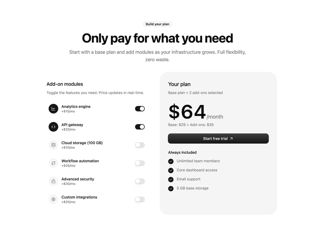
A pricing section where users toggle add-on modules on and off and watch the animated total price update in real-time.
Built with React and Tailwind. Copy the prompt and paste it into Claude Code, Cursor or Lovable: your agent adds Toggleable Add-on Pricing to your project and fits it to your theme.
Code
How Toggleable Add-on Pricing is used: the demo's code. The component's own source comes with a free account.
Usage.tsx
import Pricing from "@/components/ui/pricing-9";

export default function PricingDemo() {
  return (
    <div className="flex min-h-screen w-full items-center justify-center bg-background p-8">
      <Pricing />
    </div>
  );
}
Dependencies
More by Diar Muradi
View all

Toggle Pricing Cards
80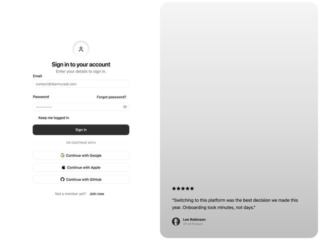
Split Sign In Form
55
ROI Pricing Calculator
52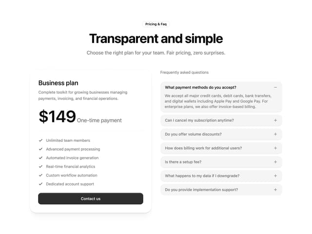
Pricing With FAQ
48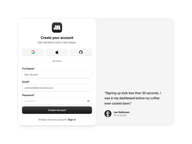
Sign Up Split Panel
43
Logo Orbit
37
Volume Pricing Card
35
FAQ Snapshot Grid
22
More in Pricing
View all
Pricing Section
610

Pricing Card
542

Pricing Section
182

RuixenPricing05
103
Single Pricing Card
799
Pricing Card With Features
176

Boxly Pricing-1
91

Pricing Cards
17

