
About
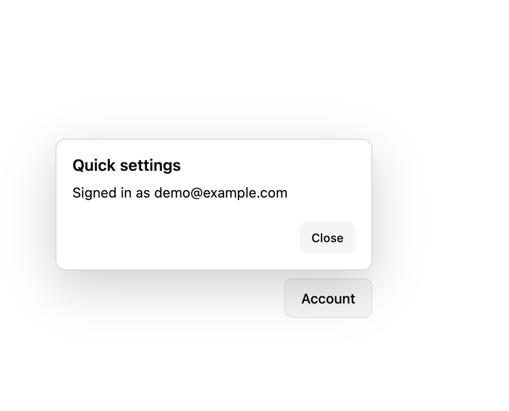
An anchored, non-modal panel for a small form or filter that opens next to its trigger button and dismisses on Escape or an outside click.
Built with React and Tailwind. Copy the prompt and paste it into Claude Code, Cursor or Lovable: your agent adds Popover to your project and fits it to your theme.
Code
How Popover is used: the demo's code. The component's own source comes with a free account.
Usage.tsx
"use client";

import { Popover } from "@/components/ui/popover";

export default function PopoverTopEndDemo() {
  return (
    <div className="flex min-h-[360px] w-full items-end justify-center bg-background p-10 text-foreground">
      <Popover placement="top-end">
        <Popover.Trigger asChild>
          <button
            type="button"
            className="inline-flex h-10 items-center rounded-md border border-border bg-secondary px-4 text-sm font-medium text-foreground"
          >
            Account
          </button>
        </Popover.Trigger>
        <Popover.Content title="Quick settings">
          <div className="flex flex-col gap-2 text-sm">
            <p>Signed in as [email protected]</p>
          </div>
          <div className="mt-3 flex justify-end">
            <Popover.Close asChild>
              <button
                type="button"
                className="inline-flex h-8 items-center rounded-md bg-secondary px-3 text-xs font-medium text-foreground"
              >
                Close
              </button>
            </Popover.Close>
          </div>
        </Popover.Content>
      </Popover>
    </div>
  );
}