
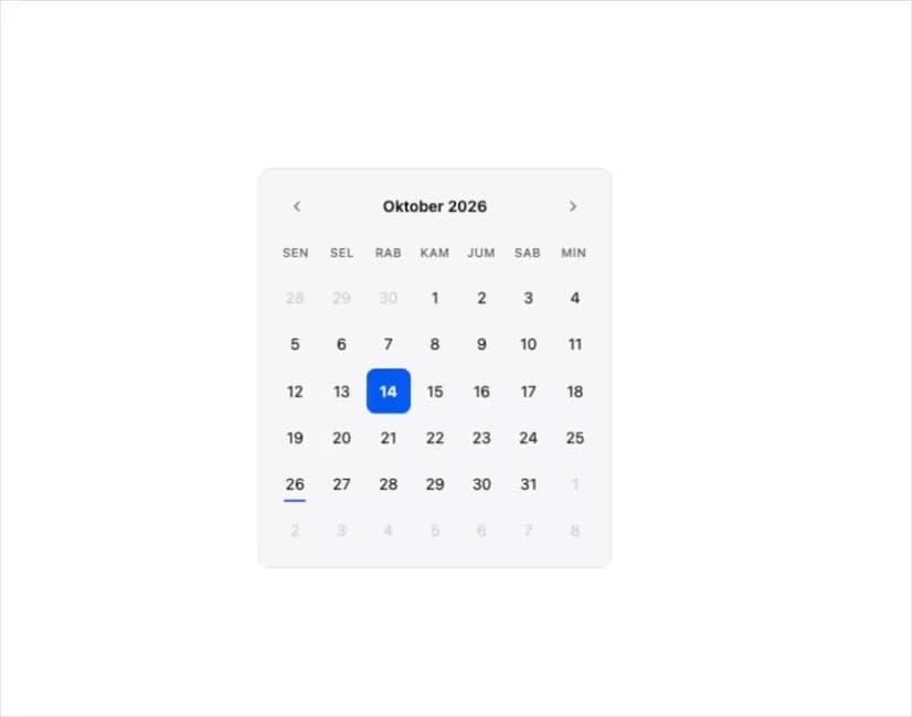
About
A single-date calendar picker with an iOS-style month grid, previous/next navigation, min/max and disabled-date constraints, and horizontal swipe to change months.
Built with React and Tailwind. Copy the prompt and paste it into Claude Code, Cursor or Lovable: your agent adds Date Picker to your project and fits it to your theme.
Code
How Date Picker is used: the demo's code. The component's own source comes with a free account.
Usage.tsx
import * as React from "react";
import { DatePicker } from "@/components/ui/date-picker";

export default function DatePickerDemo() {
  const [date, setDate] = React.useState<Date | undefined>(undefined);
  return (
    <div className="flex w-full items-center justify-center p-6">
      <DatePicker
        value={date}
        onChange={setDate}
        className="w-full max-w-xs rounded-lg border border-border"
      />
    </div>
  );
}
Dependencies
More by serayudigital
View all
Data Table

Chat Bubble
More in Forms
View all

Premium Auth
525

Contact Card
1K

Form
16

Card Studio
41

Login 2
7

Book A Demo 3
90
Book A Demo 1
74

HeroUI Field Error
10