
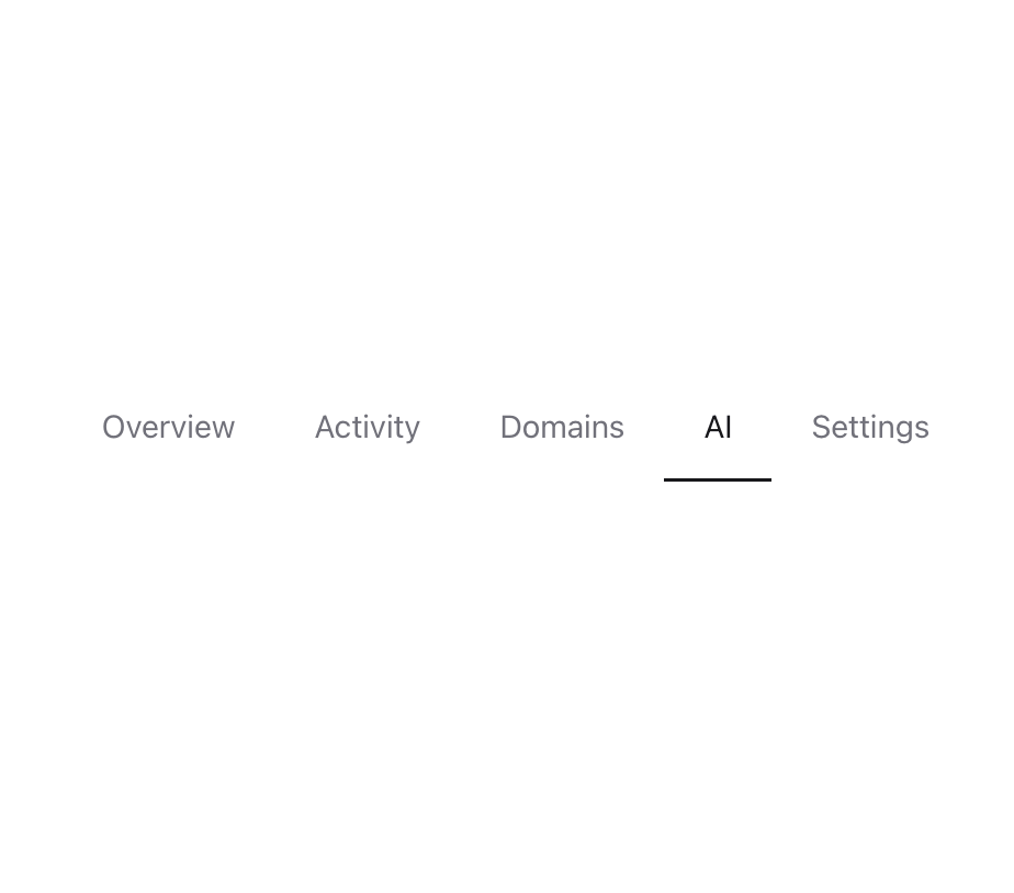
About
A dynamic, animated navigation component with interactive tabs that dynamically highlight active and hover states.
Built with React and Tailwind. Copy the prompt and paste it into Claude Code, Cursor or Lovable: your agent adds Animated Navigation Tabs to your project and fits it to your theme.
Code
How Animated Navigation Tabs is used: the demo's code. The component's own source comes with a free account.
Usage.tsx
import { AnimatedNavigationTabs } from "@/components/ui/animated-navigation-tabs"

const AnimatedNavigationTabsDemo = () => (
    <div className="bg-background h-40 flex items-center justify-center"><AnimatedNavigationTabs items={ITEMS} /></div>
);

export default { AnimatedNavigationTabsDemo };

const ITEMS = [
  { id: 1, tile: "Overview" },
  { id: 2, tile: "Activity" },
  { id: 3, tile: "Domains" },
  { id: 4, tile: "AI" },
  { id: 5, tile: "Settings" },
];
Dependencies
More by LN
View all
Pricing Interaction
1.4K
Dorpdown Navigation
1.3K
Visualize Booking
629
Assisted Password Confirmation
600
Tags Selector
565
Mega Menu
399
Feedback Slider
329
FlipButton
294
More in Navigation
View all

Sidebar
305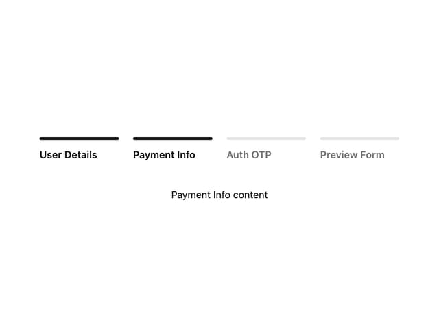

Progress Bar Stepper
46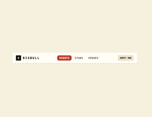
Navbar
1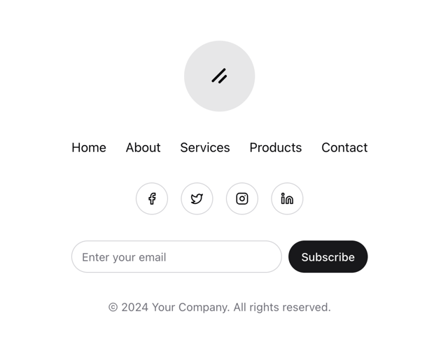
Stacked Circular Footer
431

Breadrcrumb
24
Tabs
17
Pagination with Icon and Label
17
Navbar with Theme Toggle
46

