
About
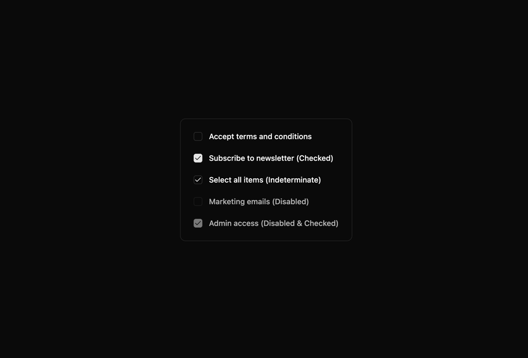
Here is checkbox base component of indevui
Built with React and Tailwind. Copy the prompt and paste it into Claude Code, Cursor or Lovable: your agent adds Checkbox to your project and fits it to your theme.
Code
How Checkbox is used: the demo's code. The component's own source comes with a free account.
Usage.tsx
// demo.tsx
import Checkbox from '@/components/ui/indevui-checkbox';

function CheckboxDemo() {
   return (
      <div className="flex flex-col items-start gap-6 rounded-lg border p-6">
         <div className="flex items-center gap-3">
            <Checkbox id="terms" />
            <label
               htmlFor="terms"
               className="cursor-pointer text-sm font-medium leading-none peer-disabled:cursor-not-allowed peer-disabled:opacity-70"
            >
               Accept terms and conditions
            </label>
         </div>
         <div className="flex items-center gap-3">
            <Checkbox id="checked" defaultChecked />
            <label
               htmlFor="checked"
               className="cursor-pointer text-sm font-medium leading-none peer-disabled:cursor-not-allowed peer-disabled:opacity-70"
            >
               Subscribe to newsletter (Checked)
            </label>
         </div>
         <div className="flex items-center gap-3">
            <Checkbox id="indeterminate" checked="indeterminate" />
            <label
               htmlFor="indeterminate"
               className="cursor-pointer text-sm font-medium leading-none peer-disabled:cursor-not-allowed peer-disabled:opacity-70"
            >
               Select all items (Indeterminate)
            </label>
         </div>
         <div className="flex items-center gap-3">
            <Checkbox id="disabled" disabled />
            <label
               htmlFor="disabled"
               className="text-sm font-medium leading-none peer-disabled:cursor-not-allowed peer-disabled:opacity-70"
            >
               Marketing emails (Disabled)
            </label>
         </div>
         <div className="flex items-center gap-3">
            <Checkbox id="disabled-checked" disabled defaultChecked />
            <label
               htmlFor="disabled-checked"
               className="text-sm font-medium leading-none peer-disabled:cursor-not-allowed peer-disabled:opacity-70"
            >
               Admin access (Disabled & Checked)
            </label>
         </div>
      </div>
   );
}

export { CheckboxDemo as DemoOne };
Dependencies
More by LN
View all
Pricing Interaction
1.4K
Dorpdown Navigation
1.3K
Visualize Booking
627
Assisted Password Confirmation
597
Tags Selector
562
Mega Menu
399
Feedback Slider
329
FlipButton
293
More in Forms
View all

Contact Card
1K

Premium Auth
525

Form
16

Card Studio
41

Login 2
7

Book A Demo 3
90
Book A Demo 1
74

HeroUI Field Error
10