
About
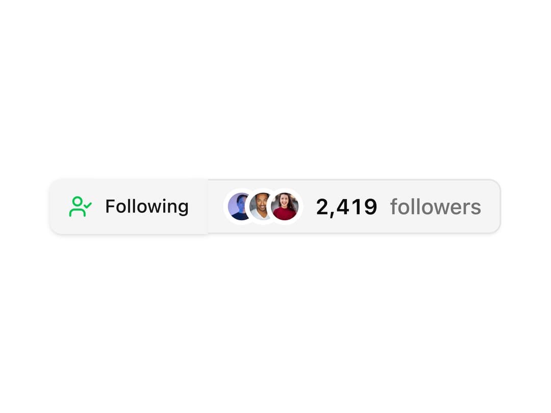
A follow/unfollow toggle button paired with a live avatar group and animated follower count, for social profile headers and creator cards.
Built with React and Tailwind. Copy the prompt and paste it into Claude Code, Cursor or Lovable: your agent adds Follow Button Group to your project and fits it to your theme.
Code
How Follow Button Group is used: the demo's code. The component's own source comes with a free account.
Usage.tsx
import ButtonGroup09 from "@/components/ui/button-group-09";

export default function Demo() {
  return (
    <div className="flex min-h-[300px] w-full items-center justify-center p-10">
      <ButtonGroup09 />
    </div>
  );
}
Dependencies
More by ShadcnSpace
View all
Integration Card
1.8K
Stacked Card Carousel
1.5K
Button witn Icon
1.4K
Orbiting Circles with Globe
1.4K
Agency Hero Section
777
Testimonials Marquee
609
Shine Border
477
Social Icon
449
More in Buttons
View all
Texture Button
98

Button
1
Button
68

Button
65

Eclipse Button
3
Button Group
14
Base Button
4

App Store Button
459

