
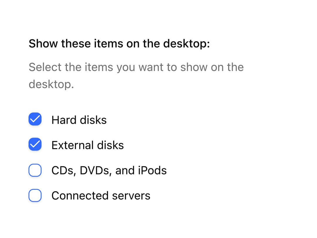
About
A labeled group of checkboxes with a legend and description text, used for letting users pick multiple related options in a form field.
Built with React and Tailwind. Copy the prompt and paste it into Claude Code, Cursor or Lovable: your agent adds Checkbox Group to your project and fits it to your theme.
Code
How Checkbox Group is used: the demo's code. The component's own source comes with a free account.
Usage.tsx
import CheckboxGroup from "@/components/ui/checkbox-group";

export default function CheckboxGroupDemo() {
  return (
    <div className="flex w-full max-w-sm items-center justify-center p-8">
      <CheckboxGroup />
    </div>
  );
}
More by uiable
View all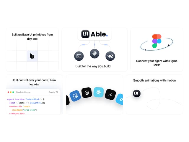

Feature Highlights Grid
403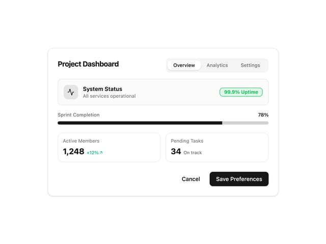
Card Tabs
110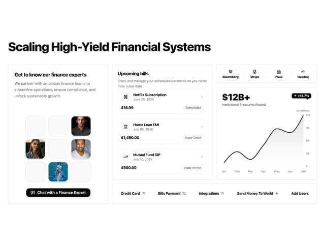
Financial Bento Grid
90
Chart Tooltip
75
Portfolio Showcase Grid
68
Marketing Hero Section
67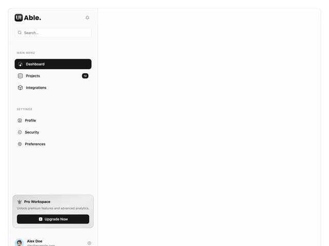
Sidebar with Search and Profile
56
Position Sonner
48
More in Forms
View all

Premium Auth
525

Contact Card
1K

Login 2
8

Card Studio
41

Form
16

Book A Demo 1
74

HeroUI Field Error
10
Book A Demo 3
90